With the introduction of the AVG, privacy by design has become a hot item. But in addition to the privacy by design principle, accessibility by design should also become the standard. The community that is connected to the content management system WordPress has both issues (privacy and accessibility) high on the agenda.
WordPress
In 2012, when I started building websites with the WordPress, about 17 percent of all websites around the world turned on this CMS. Meanwhile, the market share has increased by more than 82 percent and WordPress is the basis for 31 percent of all websites. One-and-thirty percent.
The success of WordPress is in my eyes due to two things. The fact that it is an open source project and the huge community that is involved in the CMS. Some impressive statistics about the community:
- There are more than 840 WordPress meetup groups around the world
- These are spread over 66 countries and 535 cities
- In total more than 511,000 members are connected to these meetups
- In 2017, 126 official WordCamps were held
- In total more than 800 WordCamps were organized, in 69 different cities, 65 countries and 6 continents.
WordCamp
A WordCamp is a conference that is fully focused on WordPress. All WordCamps are organized by volunteers, which says a lot about the involvement of the community. The conference day (s) is preceded or concluded with a Contributor Day. Everyone contributes to WordPress by answering support questions, translating themes and plugins, improving code and thinking about the user-friendliness of the CMS.
The sixth edition of WordCamp Europe took place in Belgrade on 14-16 June. The more than 2000 participants immersed themselves in WordPress for three days. In addition to technical presentations on, among other things, APIs and technical SEO, there were presentations about marketing, content, finances and health. In the rest of this article you will read my main learnings that I gained during WordCamp Europe.
Gutenberg
Founder Matt Mullenweg came by to talk about the developments around Gutenberg, the new text editor for WordPress. The current editor still looks like a kind of Word document. In a few months (mid-August) this will change into a block editor where you can go in different directions with regard to layout and styling.
The editor becomes fully adaptive and can be used on both small and very large screens. You can, among other things, link blocks together so that the styling that you apply to one block is automatically applied to the other block.
The favorite feature of Mullenweg in the Gutenberg editor is the copy-paste function that allows you to easily copy text from other word processors. This sometimes causes problems, because the text stands scottish and crooked after it is pasted. Soon this problem will be over and you can easily paste text from Word and Google Docs.
Privacy by Design
Contributor Day I spent with the Core Privacy team. This team works very hard to ensure that there is attention to privacy within WordPress and within the community. Not just now because the General Regulation on Personal Data (AVG, GDPR in English) has become active, but always.
Privacy must become a fixed part of WordPress. This is based on the Privacy by Design principle: trying to identify and limit problems before they actually occur. Are we obliged? No. The end user is responsible. However, as a community we try to provide tools that make it as easy as possible for the administrators to make the website AVG-proof.
Privacy settings in WordPress
In WordPress 4.9.6 (launched on 17 May), a few major changes in privacy have been implemented. This all had to be done quite quickly. In the next version (s) the privacy settings will be further fine-tuned and rolled out. What has already been done?
- Privacy page: you can indicate on which page your privacy statement. Then a link to your privacy statement is displayed when logging in and registering.
- Export personal data: If users of your website request their personal data that your website has saved from them, you can now export them. Think of orders and comments on blogs.
- Deleting personal data: users not only have the right to request their data, they also have the right to have their data deleted. A new option has been added that makes this possible. Only a possible account is still retained, you have to manually delete it yourself.
Consent cookie response: under the reaction option on a blog, a consent option has been added for placing a cookie that stores your name, e-mail address and website for if you want to react again and do not want to re-enter this information.

Challenges for subsequent versions are the AVG-proofing of the Gravatar and the handling of embedded content that places cookies that we have no influence on. There is also a way to show all the privacy settings of the theme and the plugins in an overview, instead of different settings in different places. All topics on the agenda can be found in the Proposed Privacy Roadmap.
A11y
Accessibility, abbreviated to a11y (pronounced as ellie), is an important subject this year. Accessibility is all about making your website accessible to people with a disability. This can be a visual or auditory limitation, but also a psychological or cognitive impairment. Disabled design is also useful for people with no disability. It supports the content and functionality, making the website better and easier to visit. Just like Privacy by Design, Accessibility by Design should also become a fixed principle.
Color and shape
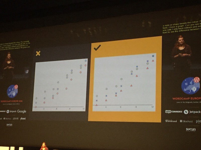
Often a color indicates a function. You can put three lines with circles in a graph and give each line a different color, but it becomes more accessible if you use three different shapes in addition to three different colors. So not three times a round, but a round, a square and a triangle. People who can not see the colors (well) can still read the graph using the shape.
A tool that has thought this over properly is Trello. They have an option to turn on a color-blind-friendly mode. All labels that have a different color are also provided with a pattern so that they can be better separated.
If you are color blind, you often do not see the links in a text if they only have a different color. By also underlining links (as in this article) the design supports the functionality and the links are even more recognizable.
Font and shape
Handwritten fonts are fashionable and fun, but they must be legible. Some fonts distort the letters so that for people with dyslexia the letters and words are barely recognizable anymore.
Excessive use of bold or italic texts and fonts that only consist of capital letters ensure that the form of words change. This makes the word more difficult to recognize if you only look at the first and last letter (which we do a lot unconsciously) and you have to focus more to be able to read the word. By restricting the use of deviating texts to what is functional, you keep your texts readable.
Did you know that a font was developed especially for people with dyslexia? The font has the surprising name ‘Dyslexia’. If you do not use this font, make sure that your letters are relatively large and use a good line spacing.
Site structure and mixed content
A logical structure in your website makes it clear to visitors where to start reading and what order they should keep. Avoid lapping text. By using paragraphs, subheadings and lists you keep things organized. If you also add photos, videos and audio, you already have a very good basis for an accessible website.
By using mixed content, everyone can decide for themselves how they take the content. If you are looking for a small piece of information, it is easier to scan a text on it than to have to search a whole video.
It is also important that people can decide for themselves what happens on a website. So no (background) videos that play automatically and images that blink. This can, for example, evoke an epileptic seizure in a visitor.
No target links
As far as self-determination is concerned: just leave links open in the same tab. The back button is the most used button of the browser, so visitors will find your website again. If you let the links open in a new tab, the back button will no longer work. This can cause confusion.
And if we are talking about links: make sure the link bearer has a clear text. So not: click here, but: contact us. And not ‘follow this link’, but: ‘read our manual’. This is much clearer for people who use a screen reader.

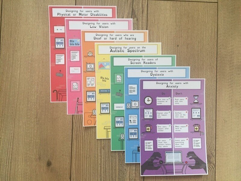
A number of accessibility guidelines are summarized on these handy accessibility maps that make it easy to see what you need to look out for if you want to make your website accessible. You will also find a lot of information in the Accessibility Handbook on make.wordpress.org.
Internal links
The Dutch are also on the podium in Belgrade. One of them is Marieke van de Rakt (partner and CSO at Yoast). In her presentation on internal link structure, she explains that a good internal link structure helps your visitors find their way around your website. In addition, it helps Google to better understand your website, making your website better indexed and ranked.
Three tips from Marieke to build your internal link structure:
Think carefully about the articles you want to rank with. Much too little attention is often paid to this. For which articles do visitors return to your website? Which articles will they purchase your products / services from? If you choose the wrong articles, you rank with an article that does not have a conversion.
If you have chosen the most important articles, make cornerstone articles from them. You do that from the less important articles on the same subject to link to the important article. This will make your cornerstone article better rank.
‘Context’ is the SEO word of 2018. Google understands the context of your article more and more and can therefore determine whether the links you use are relevant to your reader. Relevant links help you rank your site.

