Figma Community Files: Free UI Kits, Icons & Design Resources

Design archive note: This tutorial is kept on TopTut as part of the Lorelei/TopTut design archive. For newer workflows, see free Adobe alternatives, Figma Community resources, AI image generators, and WordPress image workflows.
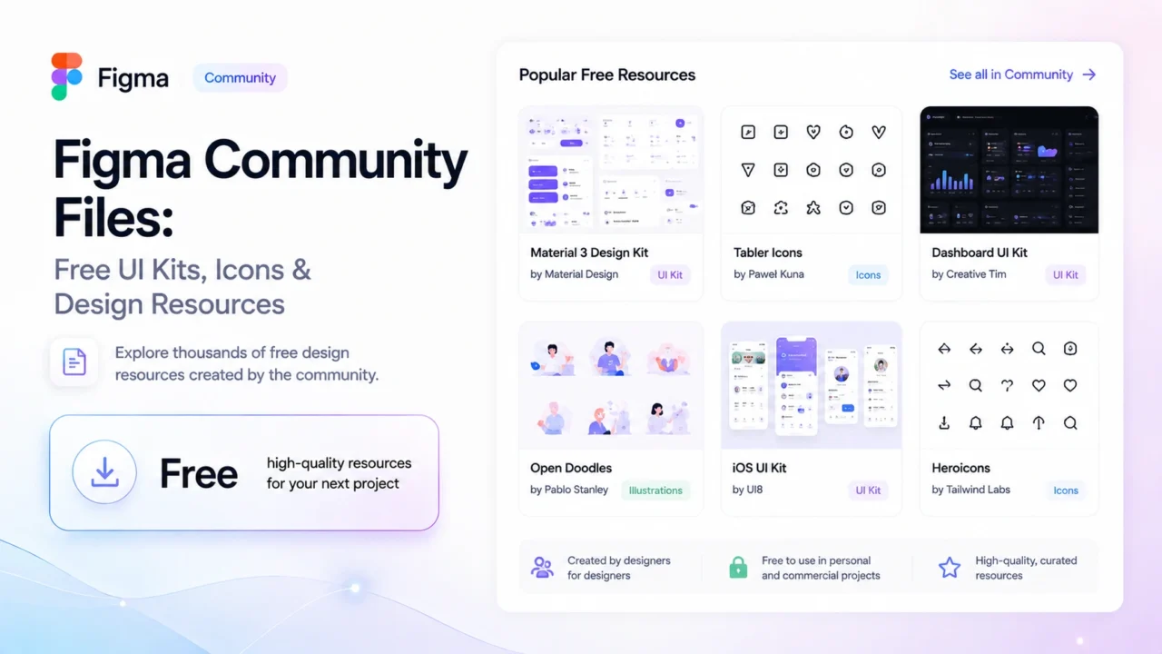
The Figma Community offers extensive, instantly duplicatable resources, though finding high-quality assets requires filtering through numerous uploads. Recommended resources include Material 3, Apple Design Resources, Untitled UI, and shadcn/ui Figma Kit, along with specialized icon sets like Phosphor and Tabler, and design systems such as Atlassian, Carbon, and Radix UI.
The Figma Community has more than 400,000 published files. A significant portion of them are low-effort uploads, abandoned projects, or technically free but actually demo versions of something that costs $49 on Gumroad. The genuinely useful files are in there, but finding them requires knowing where to look and what to ignore.
This post covers the resources I’ve actually used across two years of reaching into the Community for icons, component libraries, and wireframe starting points — along with two files I wasted an afternoon on and wouldn’t recommend to anyone.
One clarification on the “no signup required” framing: you can browse community.figma.com and preview any file without an account. To duplicate a file into your workspace and actually edit it, you need a free Figma account. Free means free — no credit card, no time limit, no trial that converts to paid. The free plan lets you duplicate unlimited Community files and open them in Figma’s editor. The only limits that matter on free are project count (3 projects in your drafts) and real-time collaboration features. For using Community files solo, those limits won’t bother you.
How to Duplicate a Community File
The process takes about 20 seconds once you know where the button is.
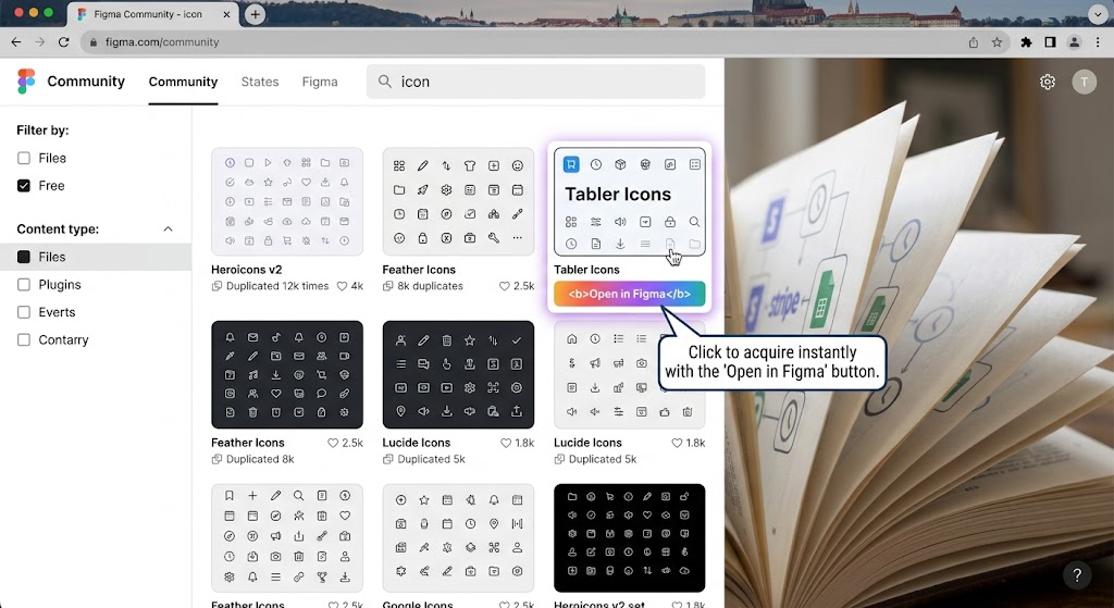
Go to figma.com/community and search for whatever you need. When you find a file, click through to its page. You’ll see a button near the top right — it’ll say either “Open in Figma” or “Duplicate.” Both do the same thing: they copy the file to your Figma drafts and open it in the editor.
If you’re not logged in, Figma will ask you to sign in or create a free account before the duplication happens. Sign in, come back to the file page, click the button again, and it works immediately.
The duplicated file is yours to edit. Changes you make don’t affect the original. If the designer publishes an update to the original, you won’t receive it automatically — your copy is a snapshot from the moment you duplicated. For something like a design system or icon set that you’re planning to rely on for a while, it’s worth checking the original page every few months to see if there’s a newer version worth re-duplicating.
The Best Free UI Kits
Material 3 Design Kit (by Google)
This is the most comprehensive UI kit on the Community. Google maintains it officially, it stays current with Material Design spec updates, and it covers the full component range — navigation, forms, dialogs, chips, cards, data tables, and on. The component count is somewhere around 7,200 when you include all variants and states.
I don’t use this for every project. If you’re not building something that follows Material Design (Android apps, Google-adjacent web products), a lot of the aesthetic won’t translate. But as a reference for how to structure a component library — how to think about variants, states, and theming — it’s one of the better examples available for free anywhere.
Community page: search “Material 3 Design Kit” and look for the verified Google author badge.
Apple Design Resources
Apple publishes official Figma files for iOS, macOS, watchOS, and visionOS. The iOS file is the most used. It includes SF Symbols integration, native components (sheets, alerts, navigation bars, tab bars), and dark/light mode variants.
If you’re designing an iOS app, start here rather than a third-party Apple UI kit. The third-party ones are almost always out of date by a version or two — Apple updates their components more often than independent creators can keep up with.
Untitled UI
This one’s worth flagging carefully because the situation is slightly complicated. Untitled UI has a free starter version on the Community and a paid full version. The free version is genuinely useful — it includes a core component set, a color system, and basic typography. It’s not the stripped-down demo that some “free” design kits turn out to be.
I’ve used the free version as a starting point for a few quick web mockups. It’s cleaner than most free options and the auto-layout is properly built for current Figma. If you find yourself wanting more (the full version has 25,000+ components), the paid license is a one-time fee rather than a subscription.
shadcn/ui Figma Kit
If you’re working alongside developers using shadcn/ui — which has become ubiquitous in React/Tailwind projects — this kit saves significant time. The components map directly to the shadcn component names and structure, so handoff conversations become “use the Dialog component with the confirmation variant” rather than trying to describe something custom. There are a few unofficial versions on Community; look for the one with the most recent update date.
Icon Sets Worth Using
Phosphor Icons
1,248 icons across six weights: thin, light, regular, bold, fill, and duotone. MIT licensed, meaning you can use them in commercial projects without attribution. This is the icon set I reach for most often, partly because the weight range gives enough flexibility for most UI needs and partly because the design quality is consistent across the whole set — there’s no weak section where icons look like they came from a different designer.
Tabler Icons
4,200+ icons, all open source under the MIT license. The main advantage over Phosphor is coverage — if you need something obscure (specific brand logos, niche interface elements, unusual symbols), Tabler probably has it. The main tradeoff is that more icons means more variation in quality at the edges of the set. The core 1,000 icons are excellent; past that, it gets more inconsistent.
Heroicons
292 icons in three styles: outline, solid, and mini. Built by the Tailwind CSS team for use with Tailwind-based projects. If your developers are already using Heroicons in code (they’re available as a React/Vue library), using the Figma kit means your design and implementation will use the same icon names and variants, which cuts handoff friction considerably.
If you need more icons than Heroicons provides, Lucide is essentially Heroicons-compatible Feather with about 400 additional icons added by the community. Both are MIT licensed.
Design Systems for Specific Ecosystems
If you’re working within a specific product ecosystem, use its official Figma file rather than a generic kit. The three most useful ones for people outside of those companies:
Atlassian Design System (ADG): Useful if you’re building Jira/Confluence apps or anything that lives in the Atlassian ecosystem. Well-maintained and current.
Carbon (IBM): IBM’s enterprise design system, covering data-heavy UI patterns — data tables, filters, complex forms, dense dashboards. If you’re designing enterprise software and want reference for how mature design systems handle information density, this is the best free example available.
Radix UI Components: Not a traditional design kit, but a Figma file that maps to the Radix component library (unstyled React primitives that underlie shadcn and many other component libraries). Worth knowing exists if you’re designing for a React codebase built on Radix.
Wireframe Kits for Non-Designers
Most wireframe kits on the Community are over-engineered for the people who actually need them. If you’re a developer, PM, or founder who needs to sketch out a flow before handing it to a designer, you don’t need 400 components. You need boxes, text, arrows, and maybe a mobile frame.
Figma’s own wireframe kit is a reasonable starting point — search “Wireframe” in the Community and look for the file published by the Figma account itself. It’s minimal without being empty.
Whimsical is actually worth considering here even though it’s not Figma. It’s a separate browser-based tool (free for basic use) that makes wireframing faster than Figma because it removes the design decisions entirely. You can’t make it look pretty even if you try, which keeps early-stage wireframing focused on structure rather than aesthetics. I’ve started a few projects in Whimsical before moving the real designs into Figma.
Files I Tried and Wouldn’t Recommend
The dashboard kit that broke every time I resized anything
About 14 months ago I duplicated a dashboard UI kit that had genuinely impressive preview screenshots — a dark-mode analytics dashboard with charts, data tables, and a sidebar. The like count was high enough that I didn’t bother checking the last-updated date.
Every single frame in the file was built with Figma’s original auto-layout, pre-2022. When Figma updated auto-layout (v3, then v4), the behavior of existing components changed in ways that broke anything relying on the old fill/hug logic. Components that were supposed to stretch to fill their containers didn’t. Resizing a card made three unrelated things jump to the wrong position.
I spent the better part of an afternoon trying to fix it before realizing the issue was systemic, not fixable without rebuilding every component. Checked the file’s Community page afterwards: last updated 16 months before I downloaded it.
The lesson I should have already known: check the last-updated date on any kit before duplicating. For anything using auto-layout heavily (which is most UI kits), files older than 18 months have a meaningful chance of behaving badly in current Figma.
The “free” icon pack that wasn’t
A Community file with a compelling thumbnail: 600+ icons, two styles, clearly labeled “Free.” I duplicated it, opened it in Figma, and found 38 icons. The rest of the frames were placeholder cards that said “Unlock full pack” with a link to a Gumroad listing.
The 38 included icons were fine. The Community page description did technically say “free starter pack” in the third paragraph, but the title, thumbnail, and prominent placement all implied otherwise. I don’t begrudge the creator selling their work — the full pack at $24 seemed fair for 600 icons. What I objected to was the framing, which was clearly designed to get the Community click before clarifying the actual scope.
Before duplicating any resource that seems too comprehensive to be fully free, read the full description on the Community page, not just the title. Look for language like “starter,” “preview,” “lite,” or “sample.” If the description has a link to an external store, the free version is probably not the whole thing.
Top Creators to Follow
The Figma Community’s follow feature means new files from people you follow show up in your feed. A few worth following if you use Community resources regularly:
Figma (official account): Publishes template files, tutorial resources, and new feature reference files. The official FigJam templates they put out are particularly useful for workshops and planning sessions.
Pablo Stanley: Created Humaaans (customizable illustration library with interchangeable pieces) and Open Peeps (hand-drawn style character illustrations). Both are free, MIT licensed, and genuinely charming in the way that a lot of stock illustration isn’t. If your project needs people-focused illustrations without buying a stock library, start here.
Flowbite: Publishes Figma versions of their component library, which maps to Tailwind CSS. The Figma kit and the actual component library stay reasonably in sync, which makes it useful for teams where designers and developers want to work from the same component vocabulary.
UI Prep: Primarily educational files showing how specific design patterns are built — breakdowns of how Airbnb’s search works, how Notion’s sidebar is structured. Less useful as a ready-to-use resource, more useful for understanding how to build things yourself.
Alternatives If You’re Not a Designer
Figma has a learning curve that’s worth the investment if design is part of your regular work. If you’re a developer, writer, or business owner who needs design resources occasionally but doesn’t want to invest in learning Figma properly, here are the tools that serve that use case better.
Canva: The honest answer for most non-designers. Significantly easier than Figma, enormous template library, good enough for most marketing and content design needs. Not suitable for UI/UX design or handing off to developers, but for a landing page hero image, a presentation, or social media graphics, Canva is faster.
Penpot: Open-source design tool, free to use (including the hosted version), SVG-native, self-hostable. The UI is similar enough to Figma that switching isn’t painful. If you want Figma’s capabilities without the platform dependency, Penpot is the mature choice. Community file ecosystem is smaller, though that’s improving.
Excalidraw: Free, browser-based, intentionally sketchy/hand-drawn aesthetic. Zero learning curve — if you can drag boxes and type, you can use it. Good for quick diagrams, architecture sketches, and wireframes that you want to look rough-and-draft rather than polished. I use it for quick one-off diagrams when opening Figma would be overkill.
Framer: Positioned closer to the design-to-publish end of the spectrum than Figma. If you want to design something and publish it as a live website without a developer, Framer is the most capable free option for that specific need. The learning curve is higher than Canva but lower than Figma-plus-developer.
FAQ
Do I need a paid Figma plan to use Community files? No. A free Figma account is all you need to duplicate and edit Community files. The free plan allows unlimited file duplication from the Community. The restrictions on free accounts are 3 active projects in your drafts and limited collaboration features — neither affects your ability to use Community resources.
Can I use free Figma Community files in commercial projects? It depends on the individual file’s license, which the creator sets. Most files on the Community are published under Figma’s Community license (which allows personal and commercial use with attribution) or MIT (which allows commercial use without attribution). Check the license section on the file’s Community page before using anything in a paid project. When in doubt, message the creator.
How do I find new Community files without searching every time? Follow creators whose work you like — their new uploads appear in your Figma Community feed. Figma’s Community homepage also surfaces trending and recently popular files. For specific resource types, setting up a bookmark to a filtered search URL (for example, figma.com/community/files?category=ui-kit&sort=popular) is faster than navigating through the interface each time.
Why does a file look different when I open it versus the preview screenshots? Three common reasons: the creator used fonts not installed on your system (you’ll see fallback fonts), the file uses older Figma features that render differently in the current editor, or the preview screenshots were taken on a display with different resolution settings. For font issues, check File → Missing Fonts after opening. For the others, there’s often nothing to do except note the gap for next time.
Are there Figma Community plugins worth installing? Plugins are a separate category from files, but they’re accessed the same way. The ones I keep installed: Unsplash (pull royalty-free photos directly into Figma frames), Iconify (search and insert from 150,000+ open-source icons without duplicating a whole icon kit), Contrast (checks accessibility contrast ratios), and Clean Document (removes unused styles and variables before handing off a file). None of these cost anything.
I’m a developer. Should I bother learning Figma to use Community files? Probably not for the purpose of accessing UI kits and icon sets — you can get those resources more efficiently through their code libraries (Phosphor, Heroicons, Lucide, and Tabler all have React/Vue/Svelte packages). Where Figma is useful for developers is reading design files from designers, which requires understanding Figma’s inspector panel more than knowing how to create designs. That’s a 20-minute learning investment rather than a full course.
Two years and 34 duplicated files later, the ones I actually kept open are in the minority. Phosphor Icons, the Material 3 kit for reference, a wireframe kit I barely touch, and Pablo Stanley’s illustration libraries. The rest of the Community is useful when you know what you’re looking for and disposable when you’re browsing to see what’s there. Go in with a specific problem and you’ll find something worth using. Go in to explore and you’ll be there for two hours having accomplished nothing except looking at a lot of nice-looking interface thumbnails.