
Snake Skin Effect in CSS: For Text & Photos (No Photoshop)

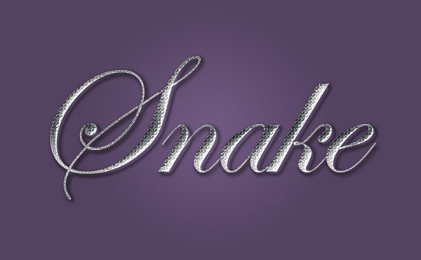
Design archive note: This tutorial is kept on TopTut as part of the Lorelei/TopTut design archive. For newer workflows, see free Adobe alternatives, Figma Community resources, AI image generators, and WordPress image workflows.
Quick Answer
You can build a convincing snake skin effect in pure CSS — no Photoshop, no texture images, no downloads. The trick is layering two kinds of radial-gradient(): a small repeating “scale” pattern (two offset copies of the same gradient tile, so the scales interlock like shingles) sitting under a few large, soft, irregularly-placed gradients for the blotchy coloring, blended together with background-blend-mode: multiply. Apply that gradient stack directly as a background for text using background-clip: text, or overlay it on a photo with a positioned ::after pseudo-element and mix-blend-mode. Both examples below are copy-paste ready.
Snake skin is a genuinely good CSS exercise: it’s not one trick but three layered together — a repeating geometric pattern, irregular color blotching, and (optionally) a subtle sheen. Once you’ve built it once, you’ve got a reusable technique for scales, fish skin, honeycomb, or any other tiled organic texture. This walkthrough builds it from the ground up, then shows it applied to both a text heading and a photo, with the full CSS to copy.
How the Effect Actually Works
Real snake skin has two visual components worth separating: a repeating scale texture, and irregular blotches of darker color layered on top of it (think of a diamondback’s diamond markings). CSS handles both with the same tool — radial-gradient() — used two different ways.
- The scale layer: one small elliptical gradient, tiled with
background-size, repeated as a second copy offset by half a tile in both directions. That offset is what makes the scales interlock in a staggered brick pattern instead of lining up in a plain grid — it’s the same trick used for CSS shingle and honeycomb patterns. - The blotch layer: two or three large, soft
radial-gradient()circles, positioned at irregular percentages, faded to transparent, and combined withbackground-blend-mode: multiplyso they darken the scale layer underneath rather than sitting on top of it as flat shapes.
Stack those as separate entries in one background-image list (CSS lets you comma-separate as many gradients as you want on a single element), and you get scales and mottling from one property, with zero image files.
Snake Skin Text Effect
Here’s the effect applied to a heading. Live demo first, full CSS underneath.
Snake Skin
.snake-text {
  font-family: Georgia, 'Times New Roman', serif;
  font-weight: 900;
  font-size: clamp(2.5rem, 9vw, 6rem);
  line-height: 1.05;
  letter-spacing: -0.01em;

  background-color: #7c5a34;
  background-image:
    radial-gradient(circle at 15% 25%, rgba(20,12,4,0.45), transparent 40%),
    radial-gradient(circle at 68% 60%, rgba(20,12,4,0.4), transparent 45%),
    radial-gradient(circle at 38% 88%, rgba(20,12,4,0.35), transparent 38%),
    radial-gradient(ellipse 22px 30px at 50% -10%, #d8b378, #7c5a34 60%, #2e2013 100%),
    radial-gradient(ellipse 22px 30px at 50% -10%, #d8b378, #7c5a34 60%, #2e2013 100%);
  background-blend-mode: multiply, multiply, multiply, normal, normal;
  background-size: 140px 140px, 160px 160px, 120px 120px, 22px 30px, 22px 30px;
  background-position: 10% 10%, 70% 50%, 35% 90%, 0 0, 11px 15px;

  -webkit-background-clip: text;
  background-clip: text;
  color: transparent;
  -webkit-text-stroke: 1.5px rgba(20,12,4,0.5);
  filter: drop-shadow(0 3px 4px rgba(0,0,0,0.35));
}
background-clip: text clips the element’s background — including the background-color fallback — to the exact shape of the glyphs, then color: transparent hides the actual text fill so the clipped background shows through instead. Keep both the -webkit- prefixed and unprefixed versions: Chrome and Safari still expect the prefix, while Firefox has supported the unprefixed property since 2016. The -webkit-text-stroke line adds a thin dark outline so letterforms stay readable even where the gradient goes light; the filter: drop-shadow() lifts the text off the page slightly, which a plain box-shadow can’t do on clipped-background text.
Snake Skin Photo Effect
You can’t blend a background-image directly onto an <img>‘s pixels — backgrounds and image content render in separate layers. So instead, wrap the photo in a container and lay the same gradient stack over it with a positioned ::after pseudo-element, then blend that pseudo-element against the photo underneath using mix-blend-mode. The box below stands in for a photo — swap in a real <img> and the CSS works exactly the same way.
<div class="snakeskin-photo">
  <img src="your-photo.jpg" alt="Describe the photo here">
</div>
.snakeskin-photo {
position: relative;
display: inline-block;
overflow: hidden;
border-radius: 14px;
max-width: 100%;
}
.snakeskin-photo img {
display: block;
width: 100%;
height: auto;
}
.snakeskin-photo::after {
content: "";
position: absolute;
inset: 0;
background-color: #7c5a34;
background-image:
radial-gradient(circle at 15% 25%, rgba(20,12,4,0.45), transparent 40%),
radial-gradient(circle at 68% 60%, rgba(20,12,4,0.4), transparent 45%),
radial-gradient(circle at 38% 88%, rgba(20,12,4,0.35), transparent 38%),
radial-gradient(ellipse 22px 30px at 50% -10%, #d8b378, #7c5a34 60%, #2e2013 100%),
radial-gradient(ellipse 22px 30px at 50% -10%, #d8b378, #7c5a34 60%, #2e2013 100%);
background-blend-mode: multiply, multiply, multiply, normal, normal;
background-size: 140px 140px, 160px 160px, 120px 120px, 22px 30px, 22px 30px;
background-position: 10% 10%, 70% 50%, 35% 90%, 0 0, 11px 15px;
mix-blend-mode: multiply;
opacity: 0.82;
pointer-events: none;
}background-blend-mode vs. mix-blend-mode — the difference that matters here
These two properties look similar and get mixed up constantly, but they operate at different levels. background-blend-mode blends the multiple background layers within a single element against each other — that’s how the blotches darken the scale pattern inside the ::after element itself. mix-blend-mode blends an element’s entire rendered output against whatever is visually behind it in the stacking context — that’s what lets the composited scale texture darken the actual photo pixels underneath. You need both here: one to build the texture, one to apply it. opacity: 0.82 on the pseudo-element controls how strongly the texture reads against the photo — drop it toward 0.5 for a subtler tint, push it toward 1 for a heavier scale look.
Customizing the Pattern
Everything here is driven by hex values and two length values (scale width/height), so re-skinning it for a different snake — or just a different brand palette — is a find-and-replace job. Three starting points:
| Look | Base | Highlight | Shadow |
|---|---|---|---|
| Diamondback (default above) | #7c5a34 | #d8b378 | #2e2013 |
| Green tree python | #2f4a2e | #8fd48a | #0e1a0d |
| Albino / pastel | #e8d9b0 | #fff6df | #c9a25f |
Swap those three colors into background-color and the two radial-gradient(ellipse ...) scale layers, and the blotch layers’ rgba() values usually don’t need to change at all — they’re already just “dark, semi-transparent,” which reads correctly against any base color. For scale size, 22px 30px is a medium scale; drop both numbers for finer detail on a smaller element, or push them up toward 40px 55px for a bold, chunky texture on a large hero image.
Optional: A Subtle Shimmer
The text demo above is already animating gently — snake scales catch light unevenly, and a slow shift in background-position sells that far better than a static texture. It’s wrapped in a prefers-reduced-motion check so it only runs for visitors who haven’t asked their OS for reduced motion:
@media (prefers-reduced-motion: no-preference) {
  .snake-text {
    animation: snake-shimmer 7s ease-in-out infinite;
  }
}

@keyframes snake-shimmer {
  0%, 100% {
    background-position: 10% 10%, 70% 50%, 35% 90%, 0 0, 11px 15px;
  }
  50% {
    background-position: 12% 8%, 68% 53%, 37% 87%, 2px 1px, 13px 16px;
  }
}
One honest performance note: animating background-position triggers a repaint on every frame rather than a cheap GPU-composited transform, so it’s fine for a slow 6–8 second cycle on one heading, but it’s not the technique to reach for if you’re animating something large or need to hit a strict frame budget elsewhere on the page.
Frequently Asked Questions
Does this work in Internet Explorer?
No, and it’s not worth polyfilling. background-clip: text and multi-layer gradient blending aren’t supported in IE11. Text will just fall back to a solid, readable color if you set one before the gradient rules — which is a perfectly fine degradation, not a broken page.
Will this hurt page speed?
If anything it helps, compared with the alternative. There’s no image file to request — the entire effect is a few hundred bytes of CSS, computed by the browser at render time instead of downloaded. The one cost worth watching is the optional shimmer animation, which repaints on every frame; skip it on pages where you’re already tight on performance budget.
Can I use this on buttons or other UI elements, not just headings and photos?
Yes — the text version works on any element with visible glyphs (headings, buttons, badges), and the photo overlay technique works on any container with content behind it, including video posters or plain colored panels. Just make sure text stays legible against the busier background; a heavier -webkit-text-stroke and a stronger drop-shadow both help at smaller font sizes.
How do I make it look more photorealistic instead of stylized?
Two directions, both still code-only. The simple one: lower the blotch opacity and tighten the scale size so the pattern reads as texture rather than illustration. The more advanced one: swap the generated gradients for SVG’s <feTurbulence> filter primitive, which produces organic, non-repeating noise — genuinely closer to real skin texture than a tiled CSS pattern, at the cost of being a fair bit more code to tune.
Wrapping Up
The whole effect comes down to two ideas stacked together: an offset gradient tile for the scales, and a few soft, irregular gradients blended on top for the blotching — then background-clip: text or a blended pseudo-element to apply it to whatever you’re styling. Once that pattern clicks, it’s a technique you’ll reach for well beyond snakes — the same layering builds honeycomb, fish scales, leather grain, or any other tiled organic texture without touching an image editor.